I’ve noticed on multiple sites now that when people don’t make their profile icons square, they usually look fine when displayed large but get squished weirdly on Active Scenes and other places they’re shown small. I think this could be ameliorated by adding:
.small-profile-icon {
    object-fit: cover;
    object-position: center top;
}
(…with the rest of the existing css for it.) The position is less important than the fit but seems to help get the image looking right-ish more often than it hurts in my tests. (It might be worth using object-fit: cover for the larger profile icons too to handle the ones that are too wide – too tall gets cut off on those, but too wide gets squished.) Object-fit and object-position are both extremely well-supported, and in any browser they aren’t, it should devolve back to the current situation.
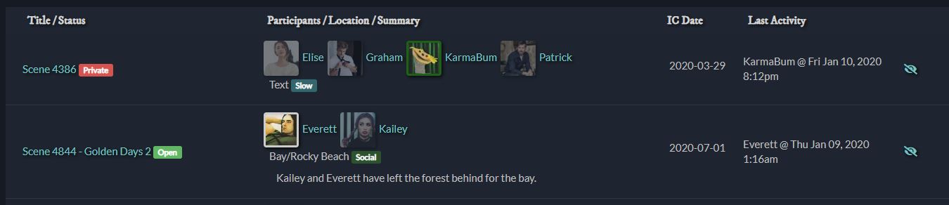
I added “Slow” as a scene type in the scenes config, then edited /app/templates/scenes-live.hbs to {{scene.location}} <span class="label label-info scene-{{scene.scene_type}}">{{scene.scene_type}}</span></p>.
@KarmaBum - Oh I can add the scene type label to the active list. That’s a good tweak.
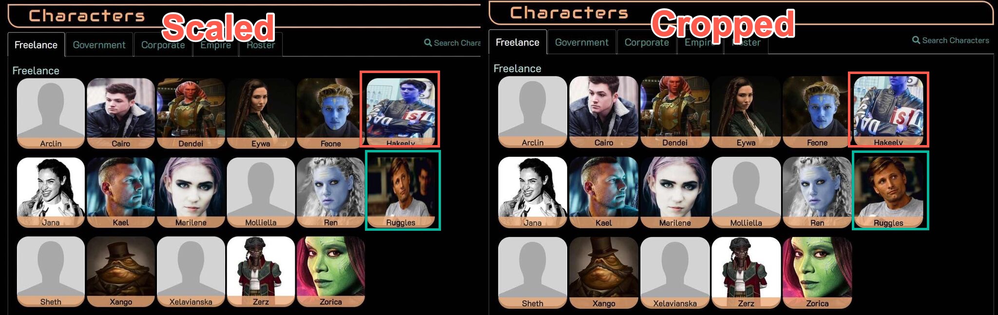
@Ren - The default style does squish the icons if the aspect ratio isn’t correct. This effect can be more noticeable on the smaller circular icons than the big ones.
There really isn’t a perfect setting. You can either have the icons squished (but show the entire icon) or you can have the icons cropped (potentially chopping off important bits of the image). Viggo and the Blue Guy in this image show how the cropped setting can make one icon better and another worse.
I prefer the scaled version over people having their heads chopped off, but that’s admittedly just a matter of personal taste. Individual games are welcome to tweak it according to their tastes. skew contributed a CSS Example if a game prefers the cropped version, and it does indeed set object-fit to cover as you suggested.
Players can also set a different copy of the image to use for their icons, as described in the icon help.
The cropping is why I said ‘ameliorated’ rather than ‘fixed’. I believe you may be in the minority on preferring squished, and that most images do better cropped. The reason I offered CSS for .small-profile-icon specifically is that each of the games I checked already cropped the pictures on the Characters directory. I assumed that was built-in! Using object-position as I included it minimizes the likelihood of chopping off the important bits, and that happens to far fewer pictures ever than look terrible squished out of proportion. With object-position: top center, that red-circled picture AND the green-circled one will both look fine in those boxes.
I went to try to use the same example you did but things have changed there too much. Using the archive of the same game, though:
(N.B.: I am not that Ren, but she looks cool. >_>)
Poking at it some more, I think object-position: center 10% might be even more reliable than object-position: center top for getting a good section. It’s true there’s no perfect solution without dealing with every image individually or requiring square images to be uploaded for profile icons, but when positioned, very few images get important bits cropped – far fewer than get squished if the ratio is ignored, and somewhat fewer than lose the tops of their head or worse to preserving ratio only. And for those very few, well, as you said, players can also set a different copy of the image to use for their icons.
I’ve resized over 80 profile pics in the last 9 months and offered them to their players. All but four were used (and three of those were the same player). Most of them didn’t know that making it square was how to fix the squishing problem, and were pretty happy to have it solved. Some didn’t know how to upload and assign an icon and needed to be walked through it. It would be nice not to end up doing that so much.
That’s fine. As I said, the CSS is there in the ares-extras section for games who prefer it.
The help file has specific steps. I can make a little tip or something on the character editor field to link to the help more obviously, so that might help.
But it really isn’t, because that does not include object-position, only object-fit. If there are instructions somewhere for how one should make a snippet-extra-thing let me know and I’ll try it, but that extra’s existence also apparently wasn’t discovered by at least two games that would have wanted it for the small icons.
It might, yes! That would be a nice thing to see. Maybe it could also recommend that profile icons be square?
The instructions for submitting extras are here. You’re more than welcome to submit your own version of the icon styling and I’ll be happy to post it.
I mean… they could have asked if it was really bugging them? Then I could’ve directed them to the extra.
The help files explain in detail how to set a different log icon from your main profile icon, and the ideal size and dimensions. It’s even discoverable under “help icon” for anyone who had a question about it.
I get that humans are reluctant to read help files, I really do, which is why I’m willing to make a more obvious link to the instructions on the icon upload tab in chargen and the character edit screen. But that’s as far as I’m willing to go on this one.
Yeah, I was suggesting it be in the little tip mostly because people are often so bad about actually reading help files. >_> Hopefully just the more obvious link to them will help!
And thank you for the link to the submission instructions!
So on reflection I caved and just included your changes in the default styling (for the next patch). I left the ‘snippet’ there because it contained some extra options for the square icons and whatnot. Thanks for the contribution
People on GH were mentioning today the wish to be able to roll uncontested for NPCs, and I was a little surprised to discover one can’t, for example, use roll Bob the NPC's Firearms/3 to do that. Is that something that could exist without getting in the way of the other roll versions – having it assume that if the part before the slash doesn’t match a character and the part after is an integer, it should roll that many dice for an NPC of that description?
(ETA: that is to say, that many plus two, same as the contested version works.)
You can roll for a NPC, it just doesn’t attach their name to it. It’s just roll 3 and in my experience it’s usually pretty obvious what you’re rolling for given the context of the scene.
And finally, for NPCs you can just roll a skill rating. An attribute of 2 is factored in automatically.
roll 3 - Rolls 5 dice total (Competent skill + Average attribute)
Huh, it looks like none of us caught/found that. I’m not sure where you’re quoting that from, but I can see that even though I looked at help roll before I asked, I didn’t correctly interpret the part about Rolling for NPCs at the bottom of it – on rereading I can see the (e.g. roll 4), but at the time I read it as saying to use a number rather than try to specify a skill for NPCs in a vs roll.
It really would be nice to be able to give a verbal description of what/who is getting rolled for, but maybe having something like roll <number> - roll <number>+2 (skill + Average attribute) dice for an NPC in the list of types of roll and letting that come up as part of qr roll also would help for spotting the one that exists?
Yeah I hear you. It’s a balance though because I want the help files to be succinct and there are many subtleties in how you use the roll command. They’re all described in the FS3 Tutorial help file. qr is not really meant to cover everything - it’s just a quick syntax prompt when you already know how the command works. But I’ll think about what you said and consider making it more readily discoverable.
ETA: I’m not sure which game you’re looking at, but the default ‘help roll’ doesn’t have a “Rolling for NPCs” section at the bottom. Your game may have done something custom to the help files.
It was Gray Harbor I was looking at, and now that I check the others – yes, I guess it did! I will admit, I probably wouldn’t ever have followed a link to a web tutorial to find a command when I was looking at it in my client and the available versions of the command appeared to be listed there. That might be lazy of me (though in my defense, I did actually read the various tutorials and help! It was just… several months ago, now), but it genuinely wouldn’t have even occurred to me there might be an unlisted one that did the thing I was looking for.
I get what you’re saying about the balance. Sometimes it’s tricky to make sure everything people need is covered without overwhelming them. I love the ability to roll anything, and I think it’s a pretty slick dice system once you know the basics; I’ve also definitely gotten the impression there are a bunch of subtleties beyond there, like the discussion about using Skill-with-modifier versus Contested-roll in different situations.
Unrelated, but I’d feel weird making another post after myself – I’m not sure how much of a pain it would be, but now that I get browser notifications from more than one Ares game, it strikes me that it would be pretty nice if the toasts used the favicon of the specific game they’re from, if it has one (and it can be shown at sufficient size)! I’d recognize more quickly where I should be looking.
I don’t think it’s unlisted so much as just the text is poorly worded.
Instead of roll <ability> which implies just an ability name, it really should say roll <roll options>.
The different items listed in help roll aren’t trying to convey all the different roll options, they’re just trying to convey the distinct commands: opposed, rolling for someone else, private rolls.
One could argue that the “roll options” should be explained in help roll too, but then that help file gets really long, which folks have complained about. So that’s why it’s part of the tutorial. I think I’ll probably just add a little statement like:
In all cases, <roll options> can be a combination of ability, ruling attribute, modifiers, or NPC dice. For example, roll Firearms or roll Firearms+Wits-1. For details and examples, see the tutorial.
[quote=“Ren, post:219, topic:141”]
it strikes me that it would be pretty nice if the toasts used the favicon of the specific game they’re from…/quote]
The Mars icon on the right is configurable in the game’s theme files. It can’t use the favicon due to image format/restrictions.
I think what you’re saying about <roll options> sounds pretty good! Given what brought this up, it might help if the example line also includes the pure number, like:
For example, roll Firearms, roll 4, or roll Firearms+Wits-1.
…partly because until you mentioned it here and I tested it, for some reason I kind of expected a number alone to get rolled like a BG skill – so, plus my character’s Wits rather than the default 2. I think having it specified as one of the options might help there, because I already knew ‘ability’ could be either of the other two types.
Thank you for the info on the notifications! I’m pleased do know games can do it. Now I just have to try to convince them they should.


 Would it be better for me to make a version with/change it so it has just the small-icon-shapes?
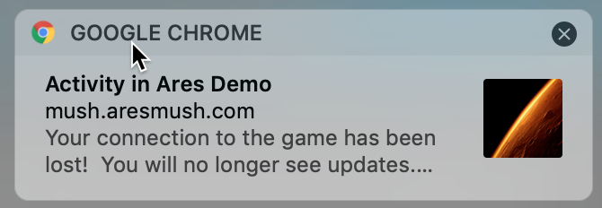