Doing a lot of messing with skinning, so I thought I’d put suggestions here for things that feel harder than they probably should be. I realize this is probably super far down on the list, but hey, documentation.
It in general seems to assume a light-background scheme. There’s no non-CSS way to change the color of the main body text, for example. This seems like a pretty basic desire.
If you do change the text color in the body to something light, it also does the input boxes, forms, etc, and you end up with a lot of fiddly light-on-light fixing to do. I’ve poked around trying to do just .container, or .body-container, but the first doesn’t do wiki pages and the second catches the input boxes again. There should probably be an easier way to do this. Maybe there is and I’m just missing it? I eventually just created myself another variable called $dark-words-color to throw at all input boxes so I didn’t have to look up the hex every time.
On wiki pages, the ‘Table of Contents’ title is not wrapped with the actual table of contents, which makes it basically impossible to style them prettily. I dug enough to find the page and shove it all in a div, but if I can save one person the headache…
Some suggestions on image size for the header would probably save some people a lot of experimentation.
These should all be addressed in the next patch. There are a couple new styles for text-color, input-text-color and input-background-color. The TOC and a few other things will be styled more properly, and I’m adding instructions for how to do advanced custom styling on Bootstrap and the dropdown menu addon. If you come across anything else that’s a pain in the butt to style, let me know.
The header image uses background:cover, which has internal logic that’s not always intuitive. I added a blurb about it, but it’s really just going to come down to experimenting with what aspect ratio looks best at the broadest range of browser widths for your particular image.
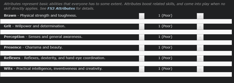
That white line appears to be in-line styling rather than a class, so it’s hard to change. Same thing for Action Skills, Background Skills, and languages.
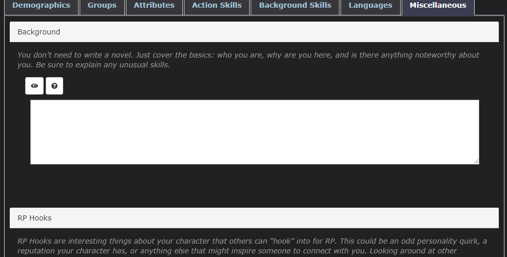
These panels that say ‘background’ and ‘RP hooks’ should probably change color, maybe to the primary color? It’s easy enough to do with CSS, but it seems like one of the things that ought to be included under ‘headers and table headings’.
‘blockquote’ is a light background, so the if you’re using light text as your primary-words-color, it goes invisible. I don’t know that there’s a nice easy change for that, so it may just be something people need to fix with CSS.
You can override that with the .fs3-divider class.
The panels have semantic meanings already from bootstrap - default panel, info panel, warning panel and danger panel. I don’t think that the default panel, the way I’ve used it across the site, really should be highlighted with the primary color. But if you want to you can change any of those panels with an override in your custom CSS like so:
Sorry for doublepost, missed this the first time. I’m going to add a ‘muted color’ or something like that to the color palette that can be used for some of these things for easier styling. Thanks for pointing it out.